Recently I purchased an ASUS Zephyrus G14. Well, it would be more accurate to say that my Zephyrus G14 recently arrived, because I actually ordered it a long time ago. There appear to have been some logistics issues affecting the supply of this laptop, at least in Australia.
My previous laptop (an MSI GT70 0NE) lasted me eight years. For five of those years it was my primary daily driver, but since building a PC I’ve only been using it to play party games. Nowadays it has about 15 seconds of battery life, it lags while playing Jackbox or Overcooked, the fans often run at full (very loud) speed, and it hasn’t gotten any lighter (3.5kg).
I was overdue for an upgrade, and boy is the Zephyrus G14 an upgrade. The RTX 2060 Max-Q gets fully 5x the FPS of the GTX 680M (in Unigine Valley Benchmark), and the R9-4900HS completes Cinebench R20 in a quarter of the time. All of this in a (comparitively) lightweight 14” design with up to 13 hours of battery life. As exciting as the performance is, if I’m honest I’d have to admit that’s not the main reason I chose this specific model. I’m a sucker for gimmicks, and my new laptop has a very cool gimmick.
From the title you might think that this post is about anime. Well, it’s true that there is a lot of anime mentioned in this post, but that’s not where the title comes from. “AniMe Matrix” is ASUS’ name for the programmable LED matrix display on the rear of the lid of certain Zephyrus G14 models. ASUS include some nice graphics and animations you can display on this by default (I’m particularly fond of the “SEE YA” animation that plays whenever you shut down the laptop) but given that ASUS pitch the AniMe Matrix as a tool for self-expression, the intention seems to be that you will create your own content for it.
In practice, I found that authoring content for the matrix is trickier than you might expect. The matrix itself is low resolution, greyscale only, skewed, and has significant light bleed between neighbouring “pixels”. Images are also rescaled before they appear on the matrix, and this rescaling also tweaks the aspect ratio. Due to all of these factors, content often ends up appearing blurry and indistinct on the panel.
Clearly a better understanding of how the matrix works would allow for authoring higher quality content. After a lot of trial and error, I might not understand everything there is to know about the AniMe Matrix, but I understand enough to create images and animations that meet my standards for quality.

In the post below, any time you see a wide side-by-side image/animation, you can click on it to get the source image/animation for yourself, if you’d like to use it on your own AniMe Matrix display. I am releasing all the images/animations on this page that I have produced under CC BY-SA 2.0 AU, but please note that many of them contain uncleared designs/logos which may be trademarked.
Three ways to author content:
Video/image filtering
Due to the limitations of the matrix display, images and animations work best if they contain simple shapes with very high contrast.
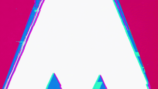
For example, this video looks quite good without any additional work:
But with a bit of colour post-processing, this can look even better.

Here I’m using the Chroma Key filter to choose the colour I care about, the pink of the triangle. Now the alpha (transparency) channel of the video represents how close to pink each pixel is.
Next I use a really useful filter, the Alpha Channel: View filter. This filter (with its default settings) discards the red, green, and blue channels, and displays a greyscale image representing the alpha channel.
Finally I use the Invert Colors filter. The reason for this is that the Chroma Key filter actually removes the colour of interest and preserves all other colours, which is the opposite of what I want.
And here you can see the result:

For other videos, more work might be required. Here’s an example:
This looks reasonable, but the shape isn’t recognisable as a 4.5 tatami room. The processing required here is much more complex.

I started with the hardest part: making the faint lines dividing the tatami mats visible. I think it’s a good idea to emphasise faint details first, because other filters might otherwise ruin those details. I used the Chroma Key filter to select the pale-orange colour of the lines. In the screenshot below I have also enabled the Alpha Channel: View filter to make it clear what regions are being matched by the chroma key.

Next I used the Blur filter. The Blur filter is useful if you want to expand objects, such as making lines thicker. If you used the obvious Size, Position & Rotate filter then it would also expand the space between the objects, which is not what I wanted here. The Blur filter does also make the lines much more faint, but we can fix that later by playing with the contrast. My goal with this blur was to make the tatami divisions roughly the same width as the outline of the room.

Next I used the Chroma Key filter again to pick out the thick black square outline around the tatami room. Again, the Alpha Channel: View filter isn’t actually applied at this point, I just have it enabled so that you can see the result of the alpha keys. The checkboxes next to each filter allow you to easily toggle it on and off, which is very useful if you want to tweak an early filter without being confused by the effects of later filters such as the Alpha Channel: View filter.

Next I properly apply the Alpha Channel: View filter because I’ve extracted all the information I wanted from the colour channels. And I do another Blur operation. This blur applies to both the tatami divisions and the room border.

I then used Size, Position & Rotate to make the animation take up as much of the available canvas as possible. When applying this filter I was careful to scrub through the timeline, as the room moves around a lot during the animation. I needed to make sure it never goes off canvas.

I really wish Shotcut had a combined Brightness & Contrast filter, but it doesn’t. I actually added the Contrast filter here first, set it to 99.9%, and then added a Brightness filter before it and experimented until I found the sweet spot where all the lines I wanted were present and nothing else.


The finishing touch was to invert the colours.


The result still isn’t perfect, but I think at least it’s recognisable. (At the very least, I know what it is and I’m happy with it)
If you want to do more advanced colour processing, ffmpeg’s geq filter is very powerful. Unfortunately I don’t have an example to hand, but in the past I’ve used filter_complex to chain geq and boxblur to achieve some pretty advanced effects, such as isolating subtitles from a video. (I looked for areas where white and black pixels were right next to each other). The geq filter is quite slow, but it allows you to do things with ffmpeg that otherwise would require you to write a lot of code.
Tweened animation
Using an existing video can yield acceptable results, but much better results can be achieved by making content specifically for the AniMe Matrix panel. Because I love open-source software, I used some FOSS called Synfig to make content for the panel.
When you’re designing animations for the AniMe Matrix, I recommend that you start off by testing the feasability of your idea by testing out key scenes as stills. This can save you the effort of animating something only to find at the end that it looks terrible due to the limitations of the panel.
The first thing I wanted to do with Synfig was to replicate the Promare title animation as best as I could:
I traced the logo in Inkscape (vector image editing FOSS) and tested it out on the AniMe Matrix panel. From these early experiments I realised that sadly the Katakana “プロメア” would not look good on the AniMe Matrix, so I decided just to include the Promare text.

Synfig can import SVGs, but it seems to treat them as immutable images, rather than manipulable shapes. Because the Promare logo animation requires moving each letter separately, I used Inkscape’s “Batch export selected objects” function to export each letter as a separate image.
After learning to use Synfig’s animation tools, I pretty quickly had a decent-looking animation:

And here it is combined with the triangle animation from earlier:

The next animation I wanted to recreate was the logo animation from the Darling in the Franxx opening. Taking a look at this you can pretty quickly see that it’s not going to fit within the resolution of the AniMe Matrix panel:
Despite being featured in the opening, this isn’t the main logo for the show. The main logo is simpler, but sadly still too complex for the AniMe Matrix:

Keeping my goals realistic, I decided to reference this simple icon instead:

The first thing I did was create a static test image of the logo to see how it looked on the LED matrix. And this is where I realised that the Darling in the Franxx animation would be significantly harder than the Promare animation.
With the Promare animation, the large shapes meant that I didn’t really have to worry about aligning edges with pixels, I just made sure there was plenty of space between shapes. With the Darling in the Franxx logo, even though it initially seems much more basic than the Promare logo, due to the thinner lines it’s easy for it to look like a blurry mess. In order to make the DitF XX recognisable, I would need to better understand how the AniMe Matrix panel works.
After a few hours of experimentation with test patterns, I had learnt enough to be able to precisely control each pixel of the matrix. Now I was able to make a pretty decent rendition of the icon:

Next it was time to animate the logo. Even though I was using a different icon, my goal was still to make an animation similar to the one from the opening.
Due to my inexperience with Synfig, the number of shapes that needed to be animated, and the fact that I couldn’t use the original as a direct reference because I was animating a different logo, creating this animation took a long time. But I’m pleased with the result:

When I initially tried exporting from Synfig directly to a GIF, the process was extremely slow. In order to preserve my sanity, I instead started exporting using the ‘ffmpeg’ option to create an mp4, then using ffmpeg to convert from mp4 to gif:
ffmpeg -i MyAnimation.mp4 MyAnimation.gifYou can probably use the ffmpeg option in Synfig to export to GIF directly, but I didn’t try this.
Pixel-art / manual animation
The next thing I wanted to add was something from Kill la Kill. I tried doing the logo animation from the start of the opening, but the logo is 16:9 and after several experiments I gave up on finding a way to make it look good on the AniMe Matrix display. The only way to make it recognisable was to make it small in the top right hand corner of the matrix, but this looked pretty underwhelming. Maybe there’s a clever way to replicate the effect of the logo that I’m not thinking of, but I think that when you’re dealing with a medium strict limitations it’s useful to accept when something isn’t possible and know when to give up.
So I switched to Plan B, which was to replicate this minimalist visual of Senketsu’s eyes that I saw a while ago.
If the eye remained static I think it might’ve been too abstract for some people to recognise as an eye, so I decided to make the eye blink and glance to the side. In order to make this animation look as good as possible even with the comparitively high amount of detail present in the eye, I decided to animate each frame by hand instead of making use of tweening. This would allow me to test each frame on the matrix display individually and have the highest level of control over the result.
I made 5 different images of Senketsu’s eye in various positions:


(Don’t ask me why I made them in that order)
Then I created a text file to represent the order I wanted the images to appear in:
file 'Senketsu2.png'
file 'Senketsu3.png'
file 'Senketsu.png'
file 'Senketsu.png'
file 'Senketsu.png'
file 'Senketsu.png'
file 'Senketsu.png'
file 'Senketsu.png'
file 'Senketsu.png'
file 'Senketsu.png'
file 'Senketsu.png'
file 'Senketsu.png'
file 'Senketsu.png'
file 'Senketsu.png'
file 'Senketsu.png'
file 'Senketsu.png'
file 'Senketsu.png'
file 'Senketsu.png'
file 'Senketsu4.png'
file 'Senketsu5.png'
file 'Senketsu5.png'
file 'Senketsu5.png'
file 'Senketsu5.png'
file 'Senketsu5.png'
file 'Senketsu5.png'
file 'Senketsu5.png'
file 'Senketsu5.png'
file 'Senketsu5.png'
file 'Senketsu5.png'
file 'Senketsu5.png'
file 'Senketsu5.png'
file 'Senketsu5.png'
file 'Senketsu5.png'
file 'Senketsu5.png'
file 'Senketsu5.png'
file 'Senketsu5.png'
file 'Senketsu5.png'
file 'Senketsu5.png'
file 'Senketsu5.png'
file 'Senketsu5.png'
file 'Senketsu5.png'
file 'Senketsu5.png'
file 'Senketsu5.png'
file 'Senketsu4.png'
file 'Senketsu.png'
file 'Senketsu.png'
file 'Senketsu.png'
file 'Senketsu.png'
file 'Senketsu.png'
file 'Senketsu.png'
file 'Senketsu.png'
file 'Senketsu.png'
Finally, I used ffmpeg’s concat demuxer to turn this image sequence into a GIF:
ffmpeg -r 16 -f concat -i SenketsuLoop.txt -r 16 SenketsuLoop.gif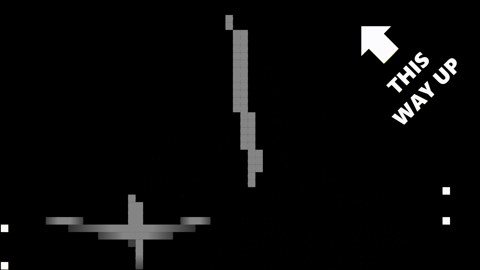
Template
You might have noticed in some of the images above that there was a fancy border around the drawings and a “THIS WAY UP” arrow. Those images were created using my template. You can download the template here.
How to use
The template is designed for use in Inkscape. If you want to use it in other software (such as SynFig), see the next section. The template is designed to create content that’s used in the diagonal mode of the Armoury Crate software, hence why the “THIS WAY UP” arrow points diagonally.
The template includes some example shapes: an outline that goes around the boundary of the matrix, the word “Hi!” which will appear diagonally on the matrix, and two lines which will appear vertically on the matrix. These can give you a feel for how designing within the template should be done, but you’ll most likely want to delete them before you actually start designing.
The template also includes a black mask which shows the region that will be visible on the matrix, four alignment squares, a diamond grid guide pattern, and a “THIS WAY UP” arrow. These objects should all be “locked”, so if you do Select All and Delete it should remove the example shapes while preserving the actual template shapes.
I’ve noticed that objects in Inkscape have a tendency to become unlocked, even when I definitely didn’t click the “Unlock Objects Below” button. If you notice that part of the template has suddenly become selectable/editable, just lock it again.
To create shapes and lines that will appear diagonally on the laptop, make lines that are horizontal or vertical on the template. Use Inkscape’s “snap to grids” feature to ensure pixel-perfect placement.
There are two ways to create shapes and lines that appear vertically or horizontally on the laptop. The theoretical best way is to make “pixel-art” style lines out of individual squares. This will light up those pixels of the LED matrix without lighting up their neighbours. But the downside is that it’s labour-intensive during the illustration process.
An easier way is to turn off “snap to grids” and rely on the “snap nodes, paths, and handles” function. This way you will snap to the diamond pattern in the background of the template. Drawing diagonals along this diamond pattern will yield results that are near-indistinguishable from the pixel-art approach. This is because the pixel-art approach suffers from light-bleed into neighbouring pixels anyway.
Once you have created your image, export it as a PNG. Make sure you choose “Page” as the export area. Then import the PNG into Armoury Crate and click the rotate button to put the image into diagonal mode.
Did you notice these white pixels that are in the template?
![]()
The purpose of those is to help you align your image on the matrix. Drag your image until the alignment pixels are outside the visible area.
![]()
![]()
![]()
Armoury Crate treats fully-transparent pixels as black. In the template, the checkerboard pattern is made out of black and transparent diamonds. In the Inkscape document properties, the background colour is set to fully-transparent grey.

Inkscape does not take into account transparency when rendering the background (so it appears grey) but when the design is exported the background is fully transparent, hence it’s treated as black by Armoury Crate.
Using the template in software other than Inkscape
While the template works best in Inkscape, nothing is stopping you from using it in other software. Here are some tips for doing so:
- Ensure that your canvas is 1920x1080px.
- If your software has grid functionality, use a 30x30px square grid. (A 15x15 grid would make drawing diagonals easier. If your software supports major/minor grids, it might be worth having a 30x30 major grid and a 15x15 minor grid.)
- Place the template on the bottom layer/behind all other objects.
- Lock the template if your software supports that.
- Use a grey background behind the template when authoring content, and change this to transparent or black before exporting.
- If you choose to hide/delete the template before exporting, consider drawing the alignment pixels yourself so that alignment is still easy.
How the AniMe Matrix works
Hardware
According to ASUS, the AniMe Matrix consists of 1,215 LEDs. In practice, I can only find 1,214 LEDs.
I have counted many times, but I’m sure there are only 1,214. I don’t have any dead LEDs in obvious places like the middle of the matrix, and adding a single extra LED to the edge of the matrix would cause it to be a weird shape.
The only possible place that an extra LED could go while still making a natural-looking shape would be in the very top right hand corner, where a pixel does indeed appear to be missing. But this same missing pixel is also shown as a little diagonal cutout in the Armoury Crate software, so I believe it’s intentionally not present.
Based on this, I have to conclude that ASUS simply miscounted. This wouldn’t really surprise me, since the Armoury Crate preview has 39 more pixels than the actual matrix, as mentioned in the “Bounds” section below.
In front of the LEDs there is an opaque panel, perforated by round holes arranged in an axonometric grid. (More specifically, it’s a dimetric grid.) Each LED is placed in the middle of a diamond of 4 holes.
The holes are spaced 2.5mm apart along each diagonal axis. Each diagonal axis is inclined 35° from horizontal. (In other words, there is a common angle of 110° between the diagonal axis.)
This results in the holes being spaced ~2.87mm apart vertically, and ~4.1mm apart horizontally.

There’s no isolation between the diamonds, so light bleeds from each to its neighbours.
The LEDs update at 16Hz, meaning you can play 16fps animations on the matrix.
Software
The AniMe Matrix can be controlled via ASUS’ Armoury Crate software. This software includes some tools for importing and tweaking content to be displayed on the matrix. It also includes a preview of what will be displayed on the matrix. (This preview is inaccurate in many ways and I recommend using it solely for alignment purposes.)

The AniMe Matrix can display content in two orientations. The default (upright) orientation considers the “pixels” of the AniMe Matrix to be diamond-shaped, with every second row staggered. In this orientation there are 55 rows and up to 33 pixels per row. (Or 66 columns with up to 28 pixels in each column, I’m not quite sure how best to represent the staggering.) A large wedge is missing from the bottom left corner, meaning there are about 35% fewer pixels than a full rectangle with the same bounding box would have.

The rotated orientation considers the pixels to be rhombi arranged in a skewed grid. In this orientation the grid has 35 rows and 60 columns, although there’s no single row with more than 55 LEDs in it.

You may have noticed that the template and my instructions above solely focus on the rotated mode. For me, the inconvenience of authoring content at an angle (and slightly skewed) is easily outweighed by the benefit of being able to precisely control each pixel without having to deal with the staggered rows. If you want guidance about the default upright orientation, you’ll have to find another blog post.
Images that are imported will be automatically rescaled to fit a 16:9 area. If the images are not 16:9, their aspect ratio will be preserved and they will be scaled to fit within the 16:9 area.
If you load in a 1920x1080 image, each pixel on the AniMe Matrix corresponds with a 30x30 area in the image. If you import a 1280x720 image the pixels are based on 20x20 areas, and if you import a 64x36 image then the pixels map 1:1. My recommendation is to author content at 1920x1080 and let Armoury Crate scale it to 64x36, as Armoury Crate’s scaling algorithm seems well-suited for the task. (Alternatively, you might achieve good results by scaling it yourself using nearest-neighbour interpolation. Other scaling algorithms tend to result in diagonals becoming blurry, as you might expect. I wonder what scaling algorithm Armoury Crate uses, because it’s not quite nearest-neighbour but it’s close to it. I think it’s some kind of weighted blending algorithm, one that’s biased towards the value of pixels in the centre of each sampled square.)
Gotchas & Limitations
Bounds
You might notice that when you import designs made using my templates into the Armoury Crate software, the design doesn’t quite seem to go to the edges. Did I make the template too small, robbing you of some precious design real-estate?
You should have more confidence in strangers on the internet! I have not made a mistake in my template. In fact this is a bug with the Armoury Crate software, which for some reason shows some pixels that aren’t actually available on the G14.
Maybe these LEDs were present in a prototype when the software was being developed? Maybe it’s just a mistake in the software? Maybe there are physically LEDs there but they’re locked in software, and ASUS plans to sell access to them later as DLC? We may never know.
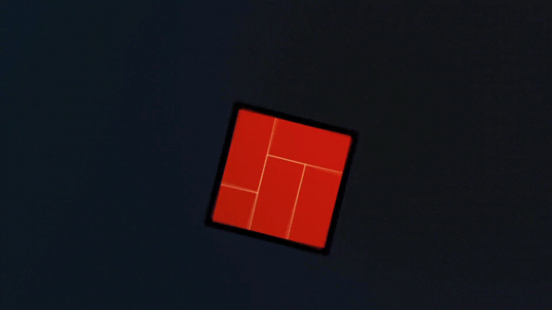
This diagram shows the affected regions in red. Anything you design in this area will appear in Armoury Crate, but not on the AniMe Matrix display. In total, there are 39 pixels that appear in the Armoury Crate preview but not on the actual matrix hardware.

Depth
Low-resolution and greyscale aren’t the only limitations with the AniMe Matrix. It’s also got quite poor depth. In the following image the panel is showing a gradient that goes from white to black. The red arrow indicates the direction of the gradient.

This image is taken in an otherwise completely dark room, which is basically a best-case scenario. In person, I’m only able to distinguish four shades on the panel. I’ll call them full, half, dim, and off. (In the photo I’m able to distinguish 5 shades, but in person only four) Even worse, the bleed between pixels means that pixels next to a full pixel will look like half pixels, and pixels next to a half pixel will look like dim pixels.
To be safe, I would suggest that you treat the panel as only supporting 3 shades, (full, dim, off) and for detailed areas treat it as pure monochrome.
It’s my hunch that the matrix does not use any gamma correction, which would explain why the darker end of the gradient has more distinguishable shades. But I haven’t done any real measurements, this is just based on my own unreliable senses, so I wouldn’t claim this with any certainty. Either way, due to the nature of the display, gamma correction isn’t likely to make much of a difference.
Conclusion
Hopefully this blog post has been informative and inspires you to create your own content for the matrix display.
This was meant to be a fairly quick blog post, but thanks to the video editing and diagram creation required it’s ended up taking me well in excess of 20 hours. That’s purely for writing the blog post, that’s not including any of the research and experiments I did on the display, or any of the time I spent authoring content for the display.
Does it make sense to invest this much time to write an article with such a niche audience? The Zephyrus G14 is just one laptop family, there can’t be that many units in the wild. On top of that, many models (probably the most popular ones) don’t have an AniMe Matrix display. And out of the relatively small amount of AniMe Matrix panels in the world, I expect only an exceedingly small fraction will be owned by people who care enough to read a long blog post about how to create graphics for the display.
In other words, no, it makes no sense to spend this much time writing this article. If you have read this far, thank you, you have made it closer to worthwhile. If anything in this article helps you to create your own content, please let me know! I’d love to see what you’ve created! You can email me at josh@joshwalsh.me.
